

THE ORIGINAL LOGO
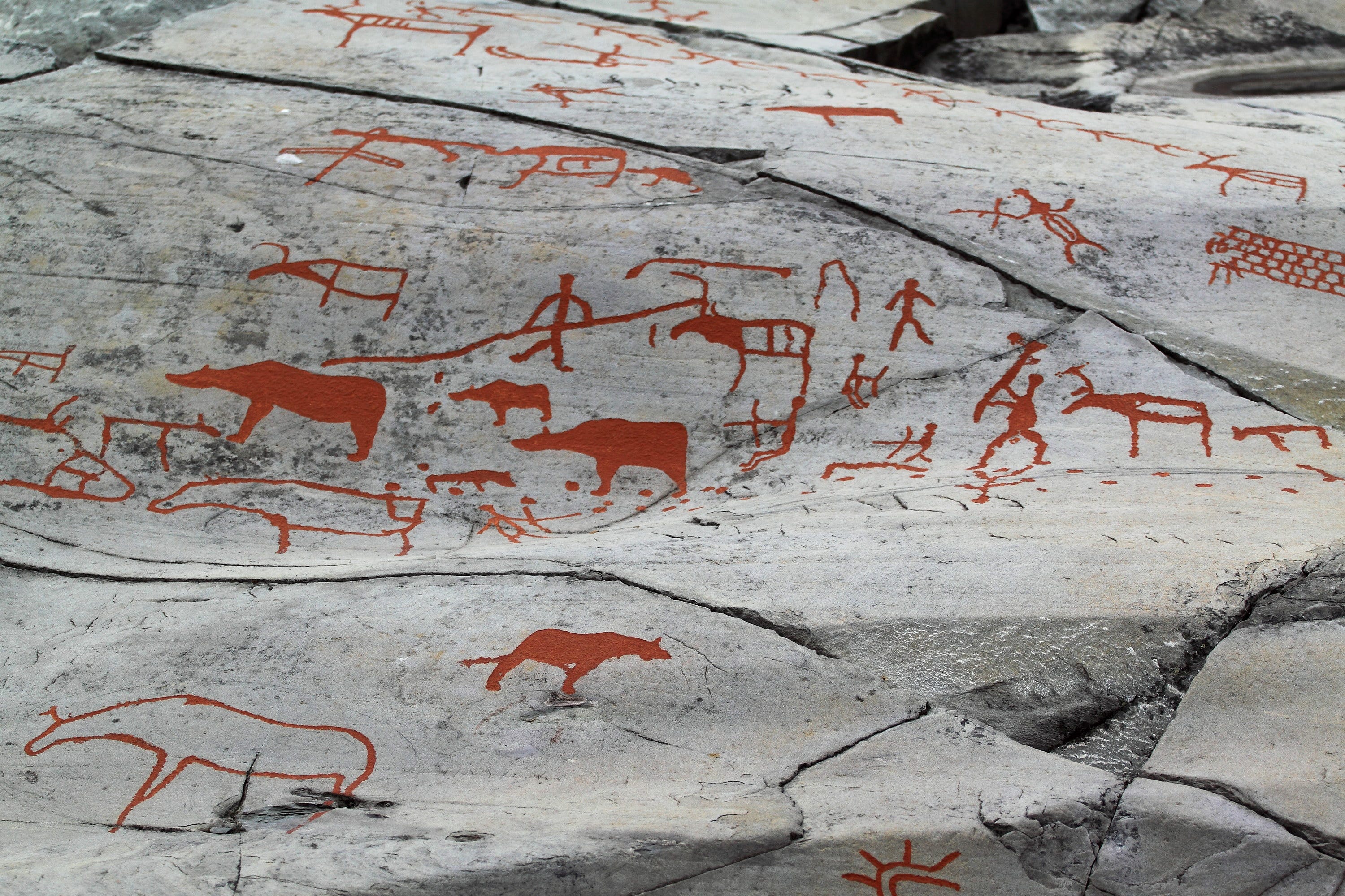
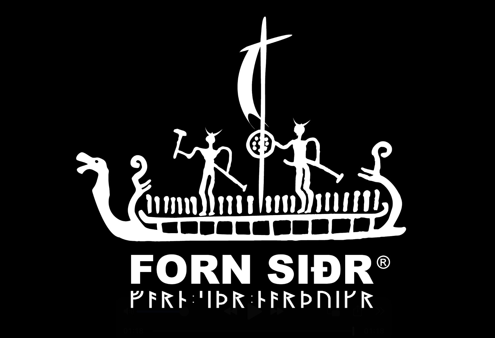
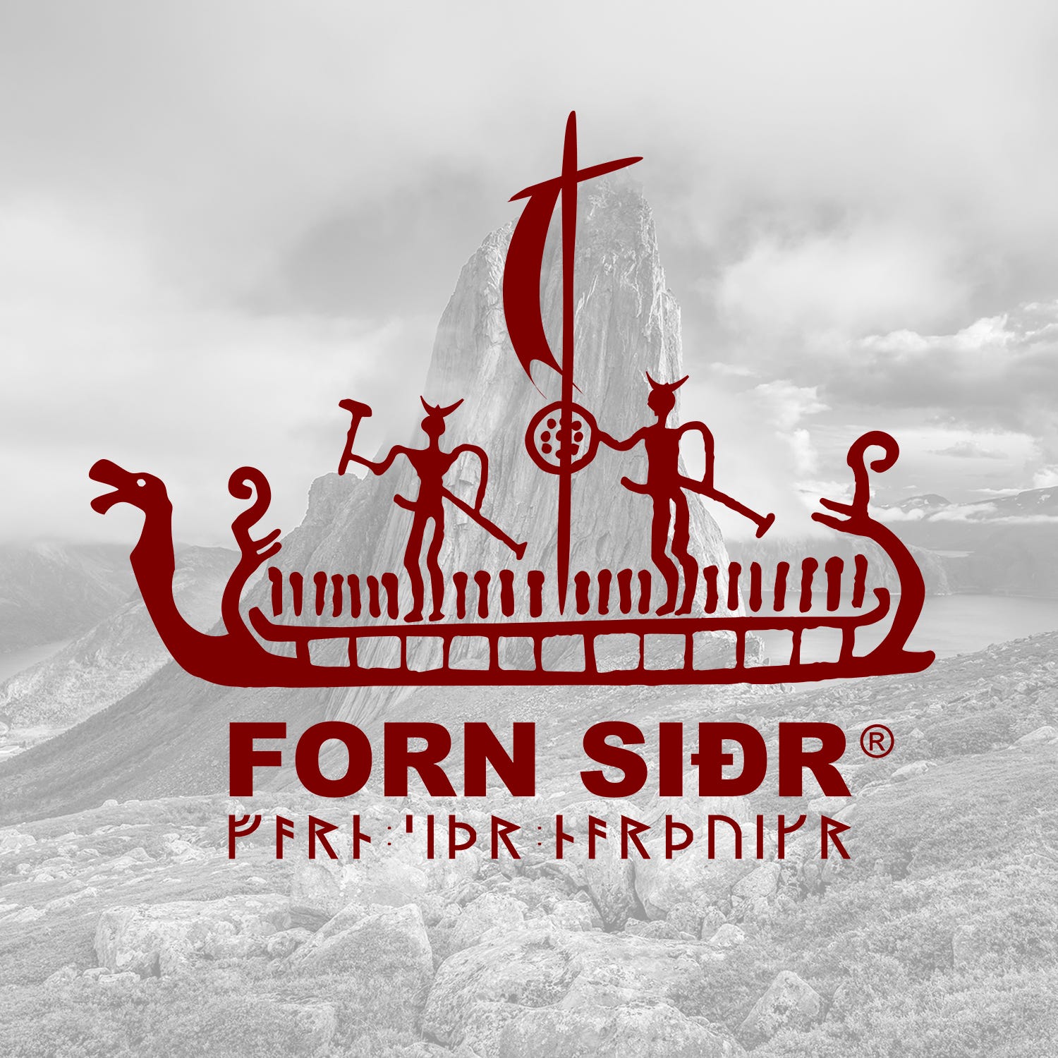
Those who have been with us for a while know that the original Forn Siðr logo was a ship with two Norsemen, inspired from original rock carvings in Alta, Norway, from around 4,200 BCE. The new logo later becoming an emphasis on one of these two Norsemen, including a quite prominent Göndull not otherwise visible on original logo.
SO, WHAT HAPPENED?
In the original logo, the Norseman at the back is in his full glory. The Norseman at the front is not. The perverts will be quick to assert that the warrior at the back got a little too excited looking at his bro’s behind. This is however nonsense. The warrior at the back is (allegedly) straight. He simply is very happy to be going on a raid. As simple as that.
As a matter of fact, the Norseman at the front was just about to be aroused as well, at the prospect of pillaging, raping, and killing morons in far away lands. Then tragedy struck. The fact that his göndull was not apparent, unlike his bro, led Asatru members at large to assume he was in fact a shield maiden. A fierce, empowered, strong woman and warrior.
Our English speaking members, particularly those in Canada, the United Kingdom and even America, will certainly understand the trauma of being misgendered. The thought of being seen as a woman caused our Norseman PTSD. However, upon reaching the shore of a yet unknown land, and imagining a blood bath proper, he started getting hard again. Thank the gods! However, tragedy struck again.
This time around, our warrior was exposed, unwillingly, to the board members of “Forn Sidr of America (FSOA)”, when we ended up in a lawsuit with the radical left extremists over their illegal use of our name. This resulted for him in an immediate loss of any potential sexual arousal. He had indeed never seen such vile, homely, repulsive, and ultimately completely undickable hoes of all genders.
RETURN TO FULL GLORY
It wasn’t too long, however, until FSOA got absolutely humiliated in U.S. courts, losing the lawsuit (see "Forn Sidr of America": We Won.) Balance was then returned to the world of men, and our warrior immediately experienced, as a result, the most epic display of Óðr ever, returning to his long awaited full glory. With our logo being immediately updated accordingly, naturally.
THE NEW LOGO
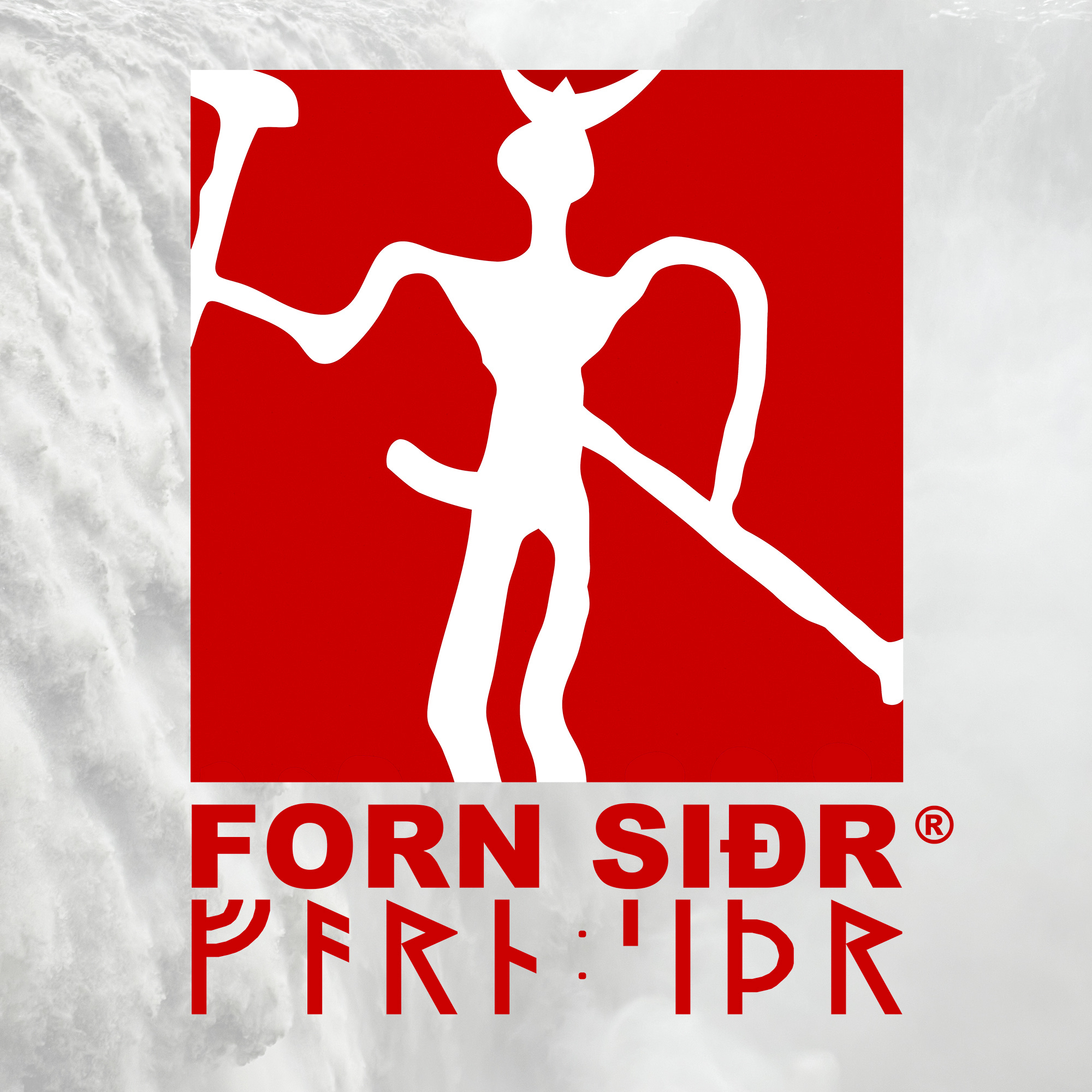
In celebration of our court success in the United States, to streamline our logo for better use on various supports, and in honor of warriors, inherently men, past, present and future, as well as in yet another marked departure from the stigmatization of manhood by desert cults, including Asatru spin offs, we then decided to emphasize on the warrior at the front of the ship. Our new logo featured that Norseman, his axe to split skulls, his spear to impale morons, and, naturally, his göndull in full glory as celebration of us men, as well as the essence of life too.
PATCHES AND THINGS
It is worth noting as well that, unlike the legacy logo, the new Forn Siðr logo is suitable for combat patches, including IR (Infrared) on a variety of backgrounds, including all multicam variations.